-crop-u6153.jpg?crc=4072080723)


-crop-u6156.jpg?crc=4167301449)


Podium
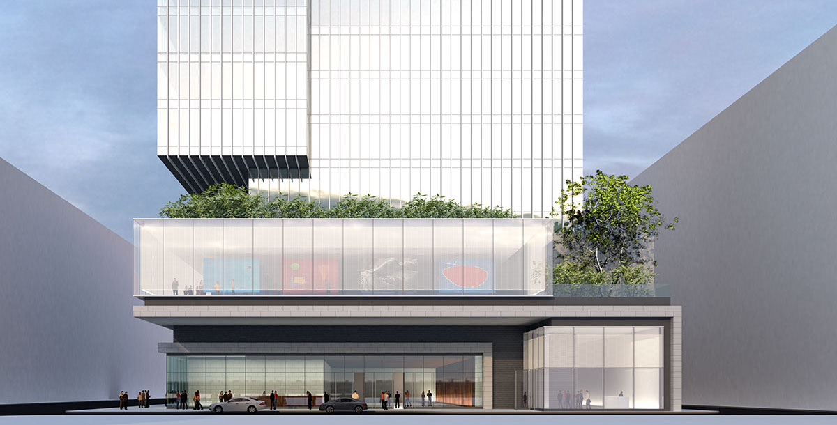
West Facade
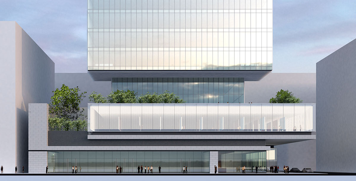
Facade on King's Road
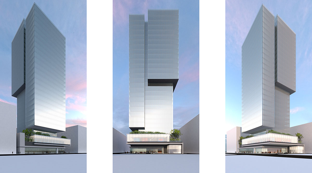
Tower
King's Road Tower
The massing of the tower has been designed to create maximum GFA on the upper floors where the full allowable site coverage has been used. In order to meet the GFA target the lower floors are recessed accordingly. This also allows to break down the mass of the building into 3 visually separate volumes.
The architectural language of the tower is one of simplicity and a minimal expression. Analysis of the sun path and environmental concerns inform the design, a fin system has been implemented on both the East and West façades to provide shading and prevent glare. At street level, the massing has been broken into volumes which are informed by the usage of the spaces. The key architectural component is a 'floating' exhibition space which fills the full footprint of the site at the first floor level. This area requires a dynamic architectural element that addresses both the interaction with the street and the design in its entirety. The gallery has a museum like quality and can be read as a floating light-box. The Gallery entrance is located on the West Facade and articulates a vertical link to both the podium and the tower above.
Project Facts:
Location:
Program:
GFA:
Height:
Client:
Architectural Design:
Status:
Hong Kong
Office Tower
45,000 m2
30 floors, 126 m
New World Development
NEDELEC
Unbuilt